Layout

A well-designed page layout effectively guides the viewer's attention, enhances information hierarchy‌ and improves overall user experience. There are many ways to approach layout based on the product surface and end-user needs—a person casually browsing their Pinterest feed needs a different layout than a developer reading our API docs or an advertiser analyzing campaign data. We’ll start here by documenting layouts for core Pinterest surfaces on mobile devices.
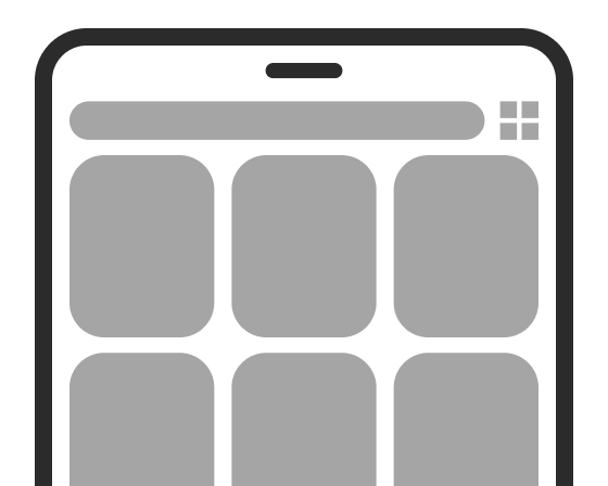
Pin grid

Grid guidelines refer to the grid layout of Pin representations (reps) only.

Phone

A two-column default grid layout on a phone.

Default view

2 Pin reps per row
A three-column compact grid layout on a phone.

Compact view

2 Pin reps per row
A one-column wide grid layout on a phone.

Wide view

1 Pin rep per row

Tablet portrait

A three-column default grid layout on a tablet in portrait orientation.

Default view

3 Pin reps per row
A four-column compact grid layout on a tablet in portrait orientation.

Compact view

4 Pin reps per row
A 2-column wide grid layout on a tablet in portrait orientation.

Wide view

2 Pin rep per row

Tablet landscape

A four-column default grid layout on a tablet in landscape orientation.

Default view

4 Pin reps per row
A five-column compact grid layout on a tablet in landscape orientation.

Compact view

5 Pin reps per row
A 3-column wide grid layout on a tablet in landscape orientation.

Wide view

3 Pin reps per row

Spacing

Margins and gutters

Spacing for margins and gutters
Space
Use case

$space-400

16px/dp
  • Margins for all text-based content (e.g. titles, body text, lists)
  • Margins inside modals (i.e. action sheet, alert, fullscreen, sheet)
  • Tablet grid gutters

$space-200

8px/dp
  • Margins for all image-based content (e.g. Pin reps, board reps, profile reps)
  • Margins inside bars (except 16 for action bars)
  • Phone grid gutters

Horizontal padding

Spacing for horizontal padding
Space
Use case

$space-400

16px/dp
  • Between button and text
  • Between image and text

$space-200

8px/dp
  • Between buttons (e.g. alerts, banners)
  • Between image and text
  • Between comment/search/send field and button

Vertical padding

Spacing for vertical padding
Space
Use case

$space-800

32px/dp
  • Between content blocks

$space-600

24px/dp
  • Between Pin reps (with metadata) on grid
  • Between board reps on profile

$space-400

16px/dp
  • Between content block and actions (e.g. banners)
  • Between items in a list

$space-200

8px/dp
  • Between Pin reps (without metadata) on grid
  • Between elements/text within the same content block

Token pending

2px/dp
  • Between stacked modules (e.g. closeup)

Banners, Modals, Toasts and Text

Phones in-line elements

Full-width minus space-200 (8px/dp) margins around banners, Toasts and Text

A spec showing 8px spacing around banners and Toasts.

Tablet portrait and landscape

64% of portrait and landscape screen width, based on 8 columns of an underlying 12-column grid

A spec showing a Toast on a tablet portrait screen with a note saying 64% of 720=461.

Spacing tokens
Alll of our cross-platform spacing tokens

Form structure and behavior
Guidelines for spacing and structuring forms on dense desktop screens

Form layout example code
Code that developers can copy and paste to layout a form quickly