Usage guidelines
- To reflect a person, company or brand within the product
- To represent a group of people, companies and/or brands. Use AvatarGroup instead
Best practices
For general Avatar best practices, refer to the Avatar web documentation.
- Use the default alternative if no image source is available. This will be the first character of the provided name.
- Don’t place elements like washes, text or icons on Avatar.
- Don’t use Avatar to represent metaphorical ideas, like a Board.
Use round Avatars in the appropriate size for your need.
Scale or change the shape of Avatar. Instead use the designated Avatar sizes and style.
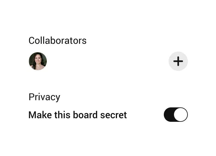
Use the collaborator’s name nearby or in an alternative view if possible.
Accessibility
People use Android’s accessibility features, such as TalkBack and dynamic text sizing to personalize how they interact with their device. Supporting these personalizations ensures that everyone has a great user experience. See Material Design and development documentation about accessibility for Android:
Accessbile design on Android
Accessible development on Android
Design tokens
Anatomy
Variants
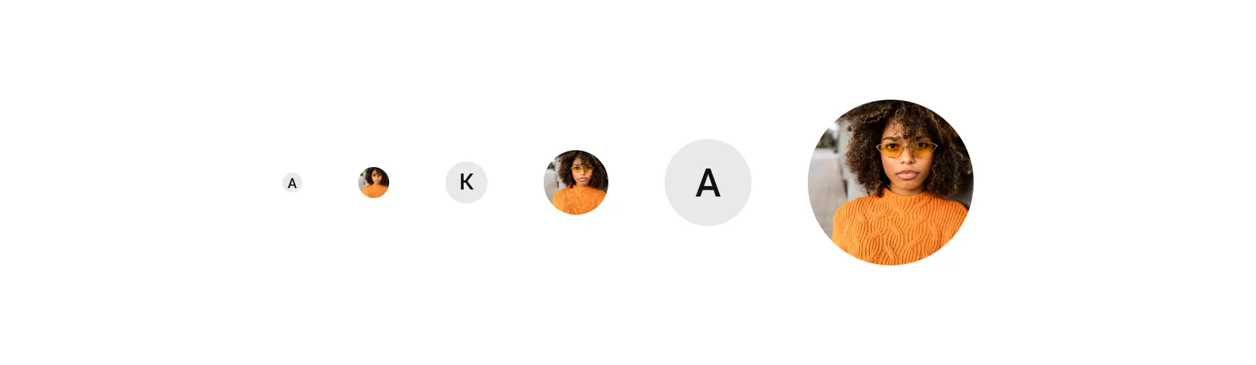
Size
- xxl (120dp)
- xl (60dp)
- lg (44dp)
- md (32dp)
- sm (24dp)
- xs (16dp)
Avatar comes in 6 different sizes.
Without an image
If there is no image source provided for the Avatar, the first character of the name provided will be used as a placeholder.
- With image
- Without image
Stroke
The avatar has an optional 1dp border.