Usage guidelines
- Performing an optional sub-task within a larger task
- Providing help while maintaining the current page and it's context
- Requesting minimal amounts of information from a user
- Capturing user's full attention for vital matters
- To display system errors. Use the appropriate messaging component instead.
- When it will distract users from their current work stream, unless necessary and intentional
- Avoid using on top of another sheet as this can create usability issues and confusion. View the transitions section for more on interaction logistics.
Best practices
- Trigger sheets via user actions, like button taps
- Include a header title. Headers can be center or start-aligned, but they should remain consistent.
- Keep the sheet footer uncluttered with clear actions
- Don’t remove the wash behind partial Sheets. The wash separates content and allows for better focus and accessibility.
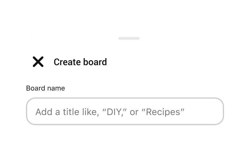
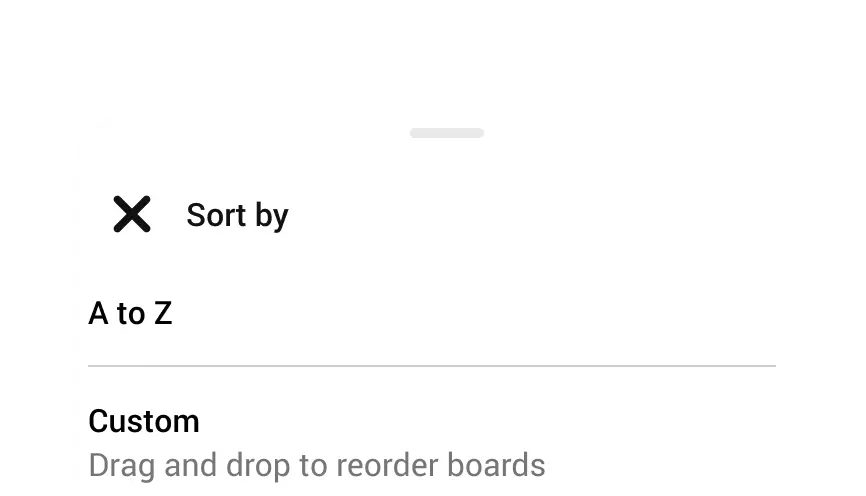
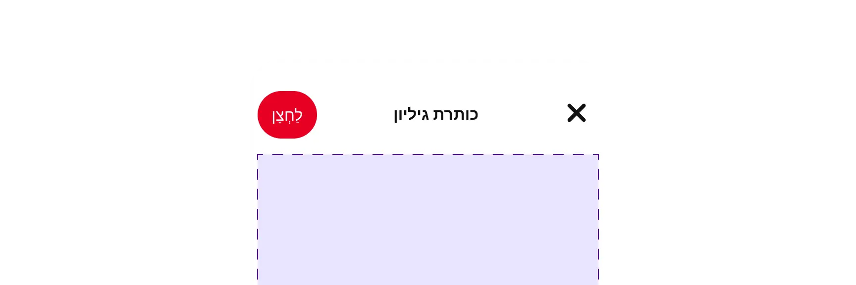
Include visible close options — multiple if possible. For example, X, back arrow, grabber, close button or outside tap.
Avoid using Buttons in the header of Sheet as this can lead to sizing and internationalization problems.
Include a grabber for resizable sheets to signal adjustability and to provide better accessibility.

Round the corners of full sheets. Only partial sheets should be rounded.
Accessibility
- Always include a grabber for resizable sheets, it aides in adjustability affordance but is also tab-accessible and usable with non-touch inputs like keyboard or switch controls.
- The accessibility role for a Sheet is "bottom sheet." When a Sheet is triggered and focus is moved to the first element in it, a screen reader will announce "bottom sheet" due to its role.
People use Android’s accessibility features, such as TalkBack and dynamic text sizing to personalize how they interact with their device. Supporting these personalizations ensures that everyone has a great user experience. See Material Design and development documentation about accessibility for Android:
Design tokens
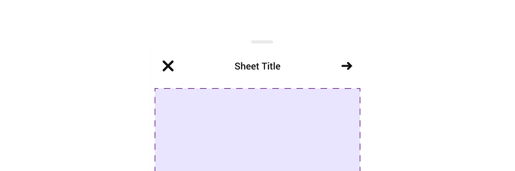
Anatomy
Full sheet
- Sheet container
- Close icon button
- Header/Sheet title
- Navigation icon button or button
- Composable content area
- Composable footer
Partial sheet
- Sheet container
- Grabber
- Close icon button
- Header/Sheet title
- Navigation icon button or button
- Composable content area
- Composable footer
- (Optional) Scrim wash
Variants
Size
Sheets are available in two sizes.
- Partial sheet
The content of a partial sheet should align with the primary screen content. Partial Sheet includes a background wash that enables the user to view the content behind, but not interact with it. Partial sheets can be set to be either resizable or non-resizable. Users can tap outside of the Sheet to dismiss. - Full sheet
A full sheet does not directly relate to the primary screen. The full Sheet occupies the entire viewport’s full height, is not resizable and must be closed to access underlying content.
Partial sheet
Full sheet
Resizing
- Resizable sheet
Resizable sheets are flexible. A user can hold on to the grabber at the top of the header and resize the sheet to a larger or smaller view port. This can happen with either partial or full sheets. - Fixed sheet
Fixed sheets cannot be changed by the user. They have a fixed size, and cannot be expanded or shrunk. These sheets do not have a grabber and can be either partial or full sheets.
Scrolling
You can vertically scroll both partial, resizable sheets and full sheets of content that are too tall.
Header
The Sheet header has a flexible configuration and can utilize several navigation actions. To improve accessibility, it is advised to use at least two different navigation elements per sheet. Below are header elements and navigation options.
Required title
The header title is required, however it can be either center-aligned or start-aligned.Optional subheader
You may add a subheader, though it is not required.Close
To close a sheet, use an icon button in the top left corner with the “close” icon.Back and forward
On Android, to return to a previous screen, use an icon button in the top left corner with a “directional-arrow-left” icon. To move to a new screen in the Shee, use an icon button in the top right corner with a "directional-arrow-right" icon.Button
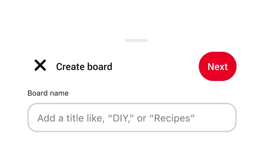
An inline Button is available for a variety of purposes, back, close, next, save, etc. However we advise caution when using due to potential localization issues.Grabber
A Grabber is a short gray line at the top of the sheet that tells the user that the sheet can be dragged to either collapse of expand.
The Sheet footer has a flexible configuration. It accepts many different kinds of components. However the recommendation is to restrict the number of actions as to not overwhelm the user.
Transitions
The Sheet slides up from the bottom as the initial transition. However, transitions between sheets should follow the following patterns.
Same Size
If there's a transition between Sheets of the same size, the content transitions in place.
Different Size
If there's a transition between Sheets of different sizes or with a size set to "auto", where height adjusts to content, the initial Sheet will slide down to close and the new Sheet will slide up to open.
Color
Localization
Be sure to localize the header, body content and any footer items. Note that localization can lengthen text by 20 to 30 percent.
Animation
By default, the Sheet animates up from the screen’s bottom when prompted by the user and animates down from the top when the user takes an action to exit. Visit Material Design for more information on container motion.
Writing
- Don’t truncate header text. Headers should have no more than two lines of text. If they are longer than two lines, consider revising the content.