
Usage guidelines
- For representing text as labels in UI controls such as buttons and menus
- When text is needed for any written content
- When spacing is lacking and an icon or other graphic can be a recognizable substitute for text
Best practices
Headings and titles
Use to help group text and items in a logical order.

Use to emphasize text that you want users to read. Instead, use bold body text or another UI element like a banner or popover.

Keep headings and titles short and glanceable.

Use overly long headings. If headings are dynamically generated (like a 3rd party app name), truncation will work after 2 lines, but be mindful of unintended changes in meaning.
Clearly describe the section a heading refers to.
Use vague language that doesn’t describe the section that a heading refers to.
Body and labels
Emphasize text inside of paragraphs by using a bold weight.

Emphasize text inside of paragraphs by underlining it; this can be confused with an interactive link or a button.

Use a minimal amount of sizes and styles to keep the UI clean and readable.
Mix styles and alignment, as this can be hard to read and follow.

Start-align paragraph text.

Center-align or end-align paragraph text. This is hard to read, especially for users with dyslexia.
Accessibility
Minimum text size
A minimum text size of 16sp is recommended for readability, especially for longer blocks of text. Some short text labels or secondary text can go lower than that, but smaller sizes should be kept to a minimum. Making text brief will also help with readability.
Color
For low-vision users, text color contrast is very important. To ensure accessible contrast, stick to our standard text colors. For design considerations and handy accessibility tools for checking color contrast, see our accessibility page.
Logical order
Label headings and titles as such, so that people who use screen readers (Android) can understand the flow of information.
Native features
People use Android’s accessibility features to adjust their font size system-wide. To enable system font size in an Android app, mark text and their associated containers to be measured in scalable pixels (sp). See Android’s accessibility documentation for more information:
Accessible design on Android
Accessible development on Android
Design tokens
Use these tokens for applying size, weight and color styles to Text.
Variants
Headings
Used for surface titles and section headings
Body
Used for text that is part of paragraphs or UI controls
Size
These font sizes follow those available through our Typography scale
Weight
For emphasizing text in body copy and in sizes below 16sp and below, use bold. For titles and headings, use semibold.
Alignment
Text can either be start, center or end aligned. Text can be forced to left or right align when aligning integers in tables.
Colors
You can specify which color you want for your text. Most colors automatically change between light and dark modes, but the light and dark properties are available when light or dark colors are specifically desired. An example is using the dark mode error color on a dark background in light mode.
Styles
Text can be italicized for emphasis, or underlined to denote a link.
Overflow and truncation
For general guidelines around text truncation, see Typography Best practices
Writing
- Keep text in UI short and clear
- Use Sentence case for all text that isn’t a brand name or proper noun
- Use long text labels that could end up truncating or causing space issues when translating to other languages
- Use Title Case or ALL CAPS in UI labels
- Use ALL CAPS for paragraph text unless referring to a product or other entity that uses that style
- Punctuate headings unless they are posing a question or making an exclamation
Localization
Keep text simple and short to avoid truncation or line-wrapping in UI controls like buttons when translating languages that require more characters. Avoid overriding our line-height settings, as this can result in text clipping for scripts, like Hindi, that have taller ascenders and descenders.
Right-to-left (RTL) alignment
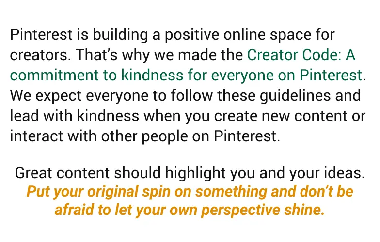
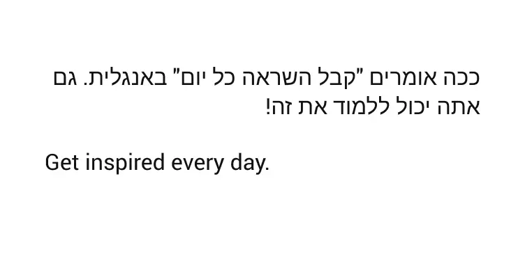
When translated to languages that read from right to left, ensure that paragraph text is aligned based on language, not on context. For example, if the UI is reversed for an RTL language like Arabic, but there is a block of text in an LTR language such as English, left-align the paragraph in English.

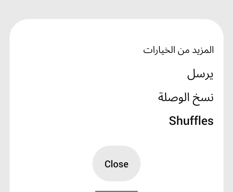
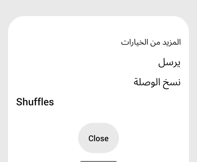
However, for lists or items in a menu, maintain the alignment of the UI.
Text-wrapping and hyphenation
Hyphenation on Android is turned off by default to avoid incorrect word breaks when strings of text wrap to the next line. This is especially helpful for international languages where an incorrect word break can greatly change the meaning of a word or sentence.
Related
A run-down of our typographic foundations across platforms