Usage guidelines
- Previewing information about recommended content (e.g. Pin feed, boards, profiles, topics, etc) that also serves as an entry point to a destination containing the content
- Card does not link to a destination
- The information and content contained within Card are not related
- The contents of Card are not the approved subcomponents (e.g. Card.Header and preview blocks(s))
Best practices
Keep Card content clear and concise. Cards are designed to focus on the imagery. Any content should be short and easily digestible.
Use too much content and overload Card. Consider if the content should live on the page instead.
Use built-in Card dimensions and appropriate spacing between Cards. This ensures consistency and a visual rhythm.
Resize Card. It is designed to adapt to the full width of a mobile screen.
Accessibility
People use Apple’s accessibility features, such as reduced transparency, VoiceOver, and increased text size, to personalize how they interact with their devices. Supporting these personalizations ensures that everyone has a great user experience. See Apple’s Human Interface Guidelines and documentation about accessibility for iOS:
Accessible design on iOS
Accessible development on iOS
- When creating a tab order in Card, Card.Header always comes before the preview block so screen-reader users get context before proceeding to the preview block alt tags.
- If Card itself is selectable, do not put other links inside it.
- Avoid wrapping an entire Card in an anchor tag as this can be a difficult experience for a screen reader user. Instead, have a single anchor tag inside Card, and have the tappable area of this anchor tag wrap the Card.
Design tokens
Use these tokens for applying size and color styles to Card.
Anatomy
1. Card
Card is a container that holds Card.Header and preview blocks by creating a consistent background and padding. The container uses the default background color and includes 8pt padding on the left and right.
2. Header (subcomponent)
Card.Header sits at the top, inside of Card container. It is a required subcomponent that includes pre-text, a title and navigational elements. Card.Header should always, at the very least, include a title.
3. Preview block (subcomponent)
The preview block is a container that sits below Card’s Card.Header. It holds a number of visual preview variations of Pinterest content. As they are designed and unified, more preview block content types will become available.
The current preview block content types are:
- Pin Feed (Montage)
- Scrolling Pins
- Boards
Variants
Card is a container that holds Card.Header and preview blocks. Card itself does not have any variants. However, the specs and dark mode are illustrated below.
Dark mode
Writing
- Keep the content concise. Convey the most important information about the content in a few words.
- Provide context to the user. The user should know what they can expect to find within a Card by reading Card.Header and pre-text.
- Use jargon or technical terms that may not be familiar to users.
- Use pre-text as helper text. It should give additional context, but should not be an in-depth explanation of Card's context.
Localization
Be sure to localize text. Note that localization can lengthen text by 20 to 30 percent.
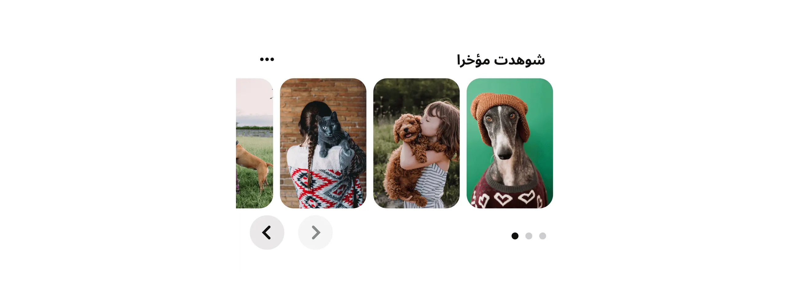
When in RTL mode, Card layout will be arranged from right to left. This means that navigation, menus and content will be mirrored to maintain consistency.