Usage guidelines
- To suggest boards containing content that a Pinner might like based on their engagement, interests, boards, demographic information, or other signals
- To suggest boards created by another user (e.g. Pinner, company, brand)
- To suggest boards featuring a Pin(s) the user has saved/looked at
- When showing any content that is not contained within Card.Boards
Best practices
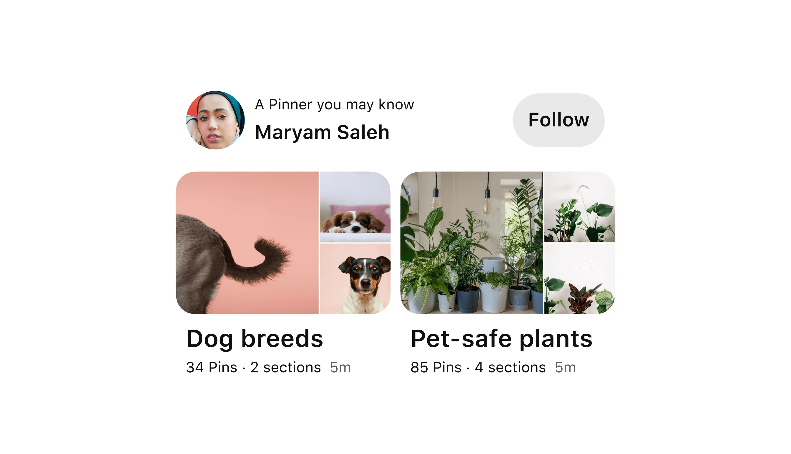
- Always show two boards or sections per Card. More or less than two will display inconsistently within Card.
- Use any variations of the Board and Section component besides CTAs. Board CTAs can interfere with the selection of Card itself.
For general Card.Board best practices, refer to the Board and Section documentation in Figma.
Accessibility
People use Apple’s accessibility features, such as reduced transparency, VoiceOver, and increased text size, to personalize how they interact with their devices. Supporting these personalizations ensures that everyone has a great user experience. See Apple’s Human Interface Guidelines and documentation about accessibility for iOS:
Accessible design on iOS
Accessible development on iOS
Design tokens
Anatomy
- Board one
- Board two
Variants
Card.Boards is a preview block utilizing the Gestalt Board and Section Figma component. The Card.Boards preview block accepts all Board and Sections variants except for CTAs. Optional elements include: lock icon, plus icon, pretext, Card.Boards name, collaborators and subtext.