Fixed preview
Card.Pins with a fixed preview communicates that the entire preview area is a tap target. It is used when the goal is to direct Pinners to a single destination (e.g. topical Pin feed) where they can scan a breadth of and/or compare related ideas.
Fixed: Usage guidelines
- To recommend a single landing experience containing related Pins (e.g. topical Pin feed, more ideas for your board) to a user based on their engagement, interests, boards, demographic information or other signals
- To suggest Pins that are not related or within a defined grouping
- When recommending more than one landing experience (e.g. 2 or more topical Pin feeds)
- When the goal is to direct Pinners to a specific place in a destination (e.g. a slot position within a stream).
Fixed: Best practices
- All images should be equal in size, whether 2up, 3up or 4up
- The entire Card.Pins preview block is a single tap target that directs Pinners to a single destination
- Make each image its own tap target. The entire Card.Pins preview block should be a single tap target.
For general specifications, refer to the MontageGrid & MontageRow documentation.
Fixed: Accessibility
People use Apple’s accessibility features, such as reduced transparency, VoiceOver, and increased text size, to personalize how they interact with their devices. Supporting these personalizations ensures that everyone has a great user experience. See Apple’s Human Interface Guidelines and documentation about accessibility for iOS:
Accessible design on iOS
Accessible development on iOS
Fixed: Design tokens
Fixed: Anatomy
Fixed: Variants
2-up
3-up (default)
4-up
Fixed: Dark mode
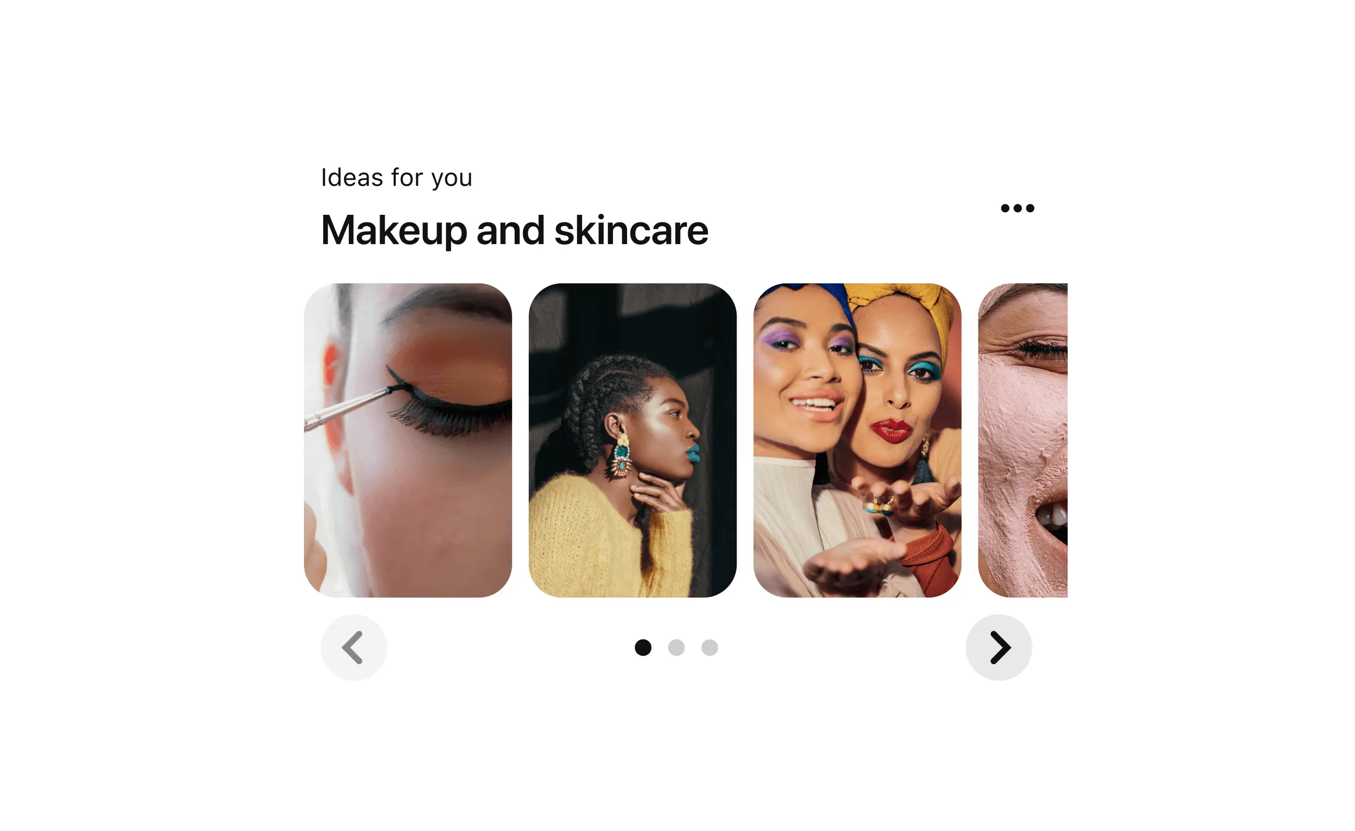
Scrolling preview
Card.Pins with a scrolling preview communicates that each preview is an individual tap target that all lead to the same destination (e.g. every preview takes you to a specific slot position within a stream).
Use scrolling preview when the user goal is best supported by focusing them on one Pin at a time.
Scrolling: Usage guidelines
- To present multiple entry points into a single destination containing Pins (e.g. stream)
- When the user goal is best supported by focusing the user on one Pin at a time (e.g. watching videos in a related stream, evaluating Pins with a high intent mindset)
- When each tap target leads to a different destination (e.g. different streams)
- When the goal is to direct Pinners to a landing experience that displays more than one Pin (e.g. a topical Pin feed).
Scrolling: Best practices
- Flex Pin previews to different common aspect ratios so that the best dimensions can be used to preview different media types
- Flex Pin previews to different sizes to support various levels of visual prominence
- Make all images within the preview block equal in size
- Use a single tap target for each preview within the preview block that leads to the same destination
- Make the entire scrolling preview block a single tap target. Each Pin preview should be an individual tap target.
Scrolling: Accessibility
People use Apple’s accessibility features, such as reduced transparency, VoiceOver, and increased text size, to personalize how they interact with their devices. Supporting these personalizations ensures that everyone has a great user experience. See Apple’s Human Interface Guidelines and documentation about accessibility for iOS:
Accessible design on iOS
Accessible development on iOS
Scrolling: Design tokens
Scrolling: Anatomy
1. Image one | 2. Image two | 3. Image three | 4. Image four